
My Summer Making Krux Easier to Use
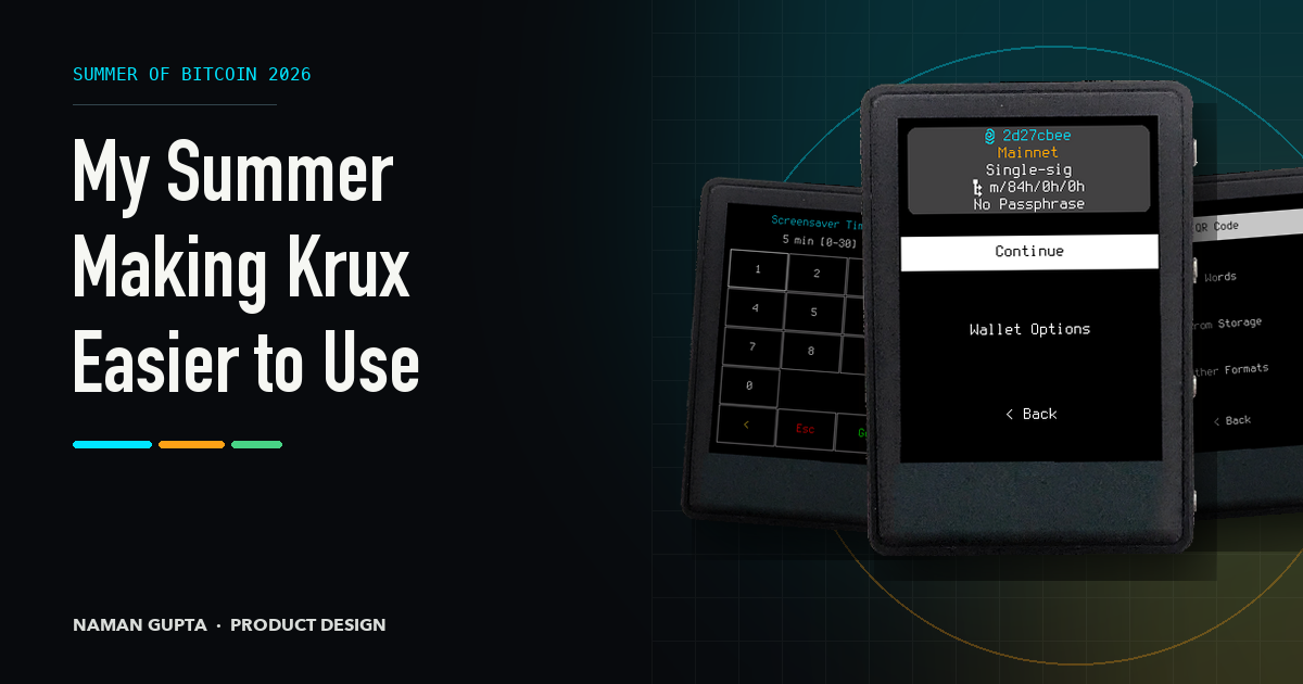
The first Krux change I shipped was a six-line method.
Before Summer of Bitcoin formally began, I opened
PR #853 to add
flash_success(). Krux already flashed red for errors, but successful actions
used the ordinary foreground colour. The new method used the active theme’s
green, making success visible at a glance.
It was a small contribution, but it gave me a route through the code, themes, tests and review process. Then I bought a TZT.
With a touchscreen, five buttons and a compact metal body, the TZT turned Krux from a simulator interface into something I could hold. Labels, taps and button presses felt more consequential on the real device. I had begun by thinking about what people could see. Using Krux made me notice what the interface asked them to decide.
What I set out to do
Krux is open-source firmware for air-gapped Bitcoin signing devices. It helps people create or recover wallet backups and approve transactions without connecting the device to the internet. Because it supports displays ranging from touchscreens to the tiny, button-controlled M5StickV, there is no single screen or input method to design around.
My Summer of Bitcoin project was an accessibility and readability audit across four areas: legibility, contrast, layout consistency and navigation clarity. I wanted to turn the strongest findings into small changes that maintainers could test, rather than redesign Krux or maximize my pull-request count.
Parts of my proposal were already outdated when I checked them against the codebase. That taught me to begin with source and tests, then mark anything that still depended on hardware or user feedback.
Building the audit
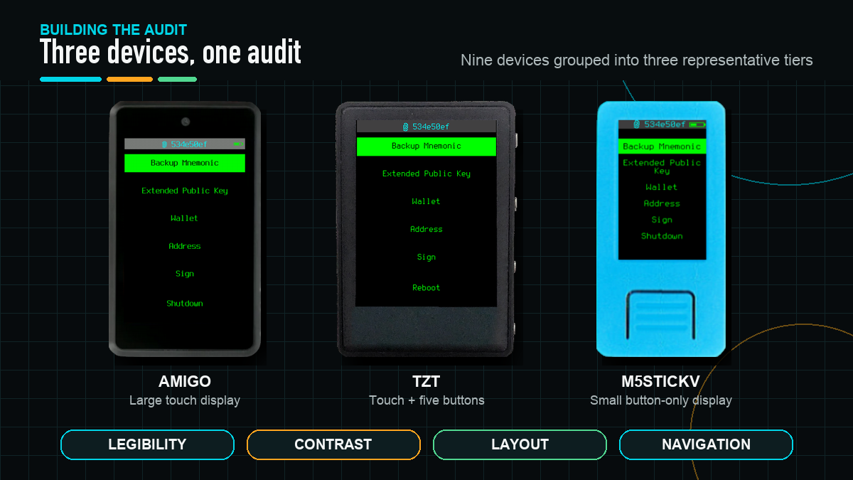
WCAG provided useful thresholds for contrast and target size, but no checklist could explain how to compare a touchscreen with a button-only hardware wallet. I built the method around Krux itself.
I grouped its nine supported devices into three hardware tiers, represented by the Amigo, TZT and M5StickV. For each audit area, I combined source checks and measurable thresholds with simulator or hardware observations. I recorded the affected device or theme, severity and supporting material, separating confirmed problems from findings that still needed device testing.
I shared weekly findings, decisions and contribution status on a public progress site. This gave my mentors one place to inspect the work and made changes in direction part of the record.
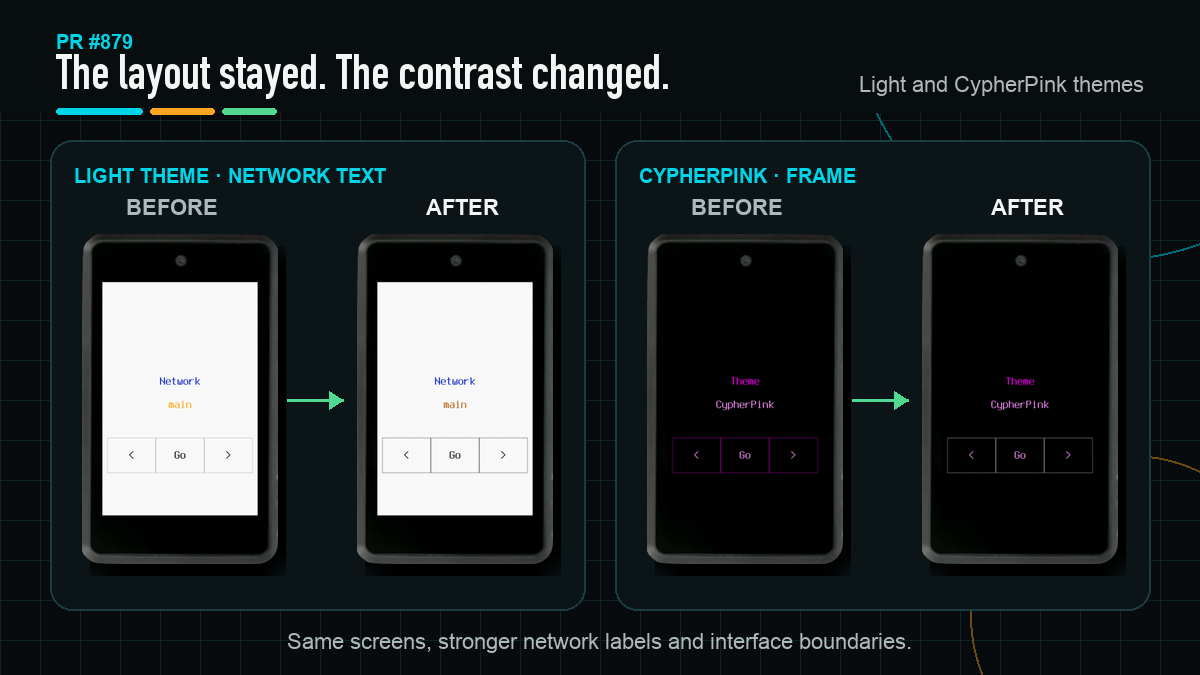
Contrast produced the clearest fixes. Krux has five themes, each with colours for text, backgrounds, frames, warnings and actions. After converting the display colours, I checked their combinations against WCAG ratios. In the Light theme, mainnet and testnet labels measured 1.97:1 and 1.37:1 against white, below the 4.5:1 target for normal text.
In PR #879, I darkened the affected Light colours, strengthened the CypherPink frame and added tests for the combinations that had failed. Important network labels and interface boundaries became easier to distinguish without changing the layouts.
One proposed colour change did not survive hardware testing. Its ratio looked better in the simulator, but the result looked worse on a real Amigo display, so I restored the device-specific behaviour. It was a useful reminder that a better ratio did not automatically mean a better result on the device.
The other audit areas also told me what not to change. Legibility and layout did not justify global font or spacing changes. Navigation, however, exposed a problem with my method: counting menu depth and button presses could show whether a new row fit, but not whether it deserved to be there.
A working change that did not earn its place
PR #894 made that weakness obvious. I added a Settings shortcut to Home for Printer and Encryption. It worked and saved steps after loading a wallet, but both settings were already available beforehand. The shortcut helped in one situation while asking everyone to consider another permanent Home option. I closed the pull request.
After that, I looked beyond path length. Did a label predict its result? Were specialist actions competing with the common path? Did people have enough context before committing, and could they recover from a wrong choice?
My mentors helped turn those questions into workable changes. odudex kept pushing me towards the smallest change that earned its place, while qlrd helped me work through tests, translations and small-device layouts. Their feedback changed both the designs and the way I evaluated them.
What I built from that lesson
The first result was PR #909.
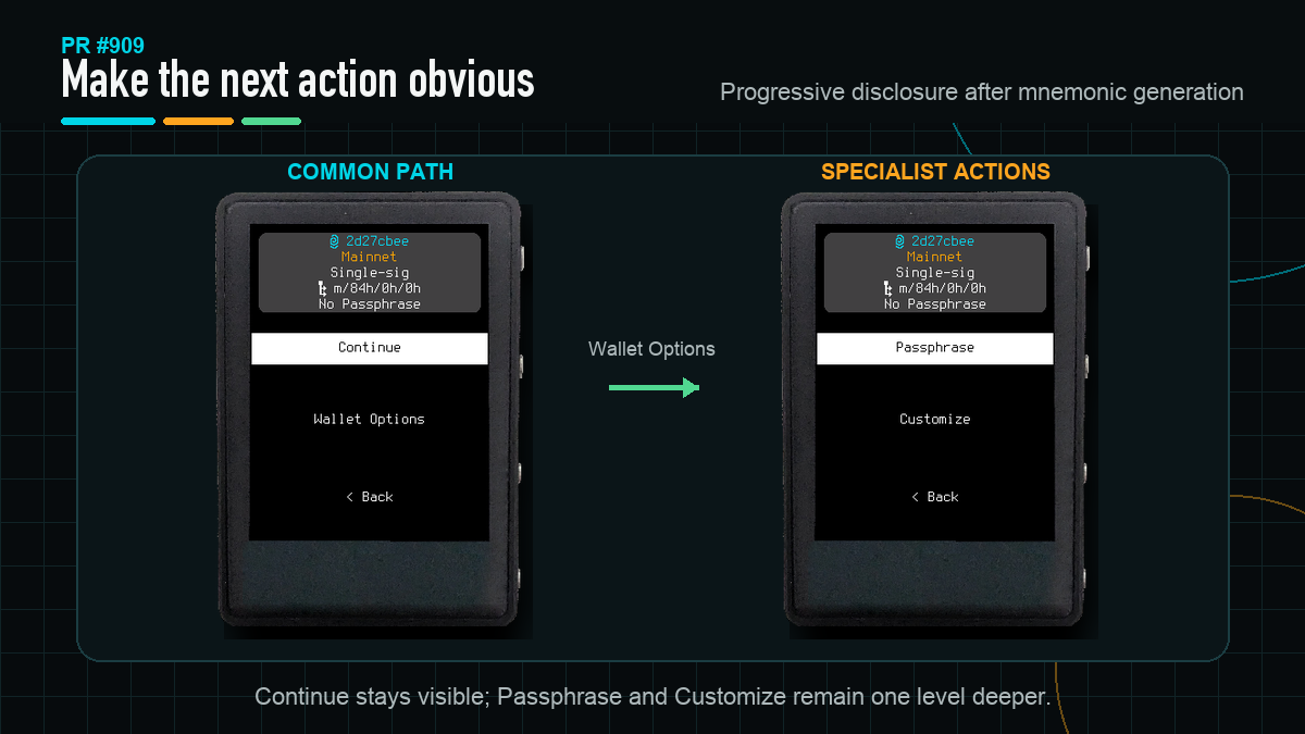
After generating wallet-recovery words, people reached a summary with three
equally prominent options: Load Wallet, Passphrase and Customize. I
changed the menu to Continue and Wallet Options, moving the less common
actions one level deeper. The summary stayed because it contains information
people should check; the existing-mnemonic flow also stayed unchanged, where
familiar wording mattered more than symmetry.
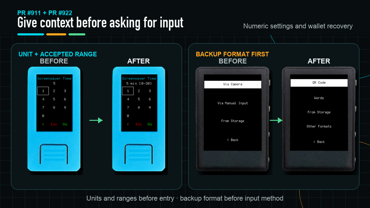
Numeric settings had a related problem. Screensaver Time and Buttons Debounce opened as bare values without first showing their unit or accepted range. For PR #911, I brought information that already existed in the settings metadata into the header, while keeping the input, validation and stored values unchanged.
PR #922 applies the same
principle to recovery. Load Mnemonic began with Camera, Manual and
Storage, asking how a backup would be entered before establishing its format.
I reorganized the menu around QR Code, Words, From Storage and
Other Formats. Common formats come first; specialist formats and the existing
validation remain available one level deeper.
I also contributed to the separate QR-keypad collaboration in
PR #811. It makes QR scanning an
optional keypad action instead of asking people to choose Type or Scan
first. I tested the keypad across device sizes and designed its QR glyph and
replacement flow. Because this direction did not come from my audit, I have kept
it separate from the changes above.
What shipped and what remains
PR #853 and
PR #879 merged through GitHub.
The work from PR #909 reached
develop through a maintainer rebase and merge, closing issue #829.
PR #911 is implemented and open
for review with passing checks.
PR #922 and
PR #811 remain open Drafts.
PR #894 is the working change I
deliberately did not ship.
The contrast fixes meet their tested thresholds and the generated-mnemonic flow now names its common next action. The open work shows context before numeric input and format before input method. I did not run a formal user study, so I cannot claim that these menu changes reduce errors or completion time. The proposed structures still need feedback from people who use different backup formats.
What I learned
I began by treating accessibility mostly as a visual problem: readable text, sufficient contrast and layouts that survived different screens. Those things matter, but a hardware wallet also has to present the right context and keep uncommon actions from crowding the usual path. A readable label can still be the wrong label at the wrong moment.
Hardware could overturn simulator confidence. Source and tests were more reliable than an old issue description. Maintainer feedback was part of the design process, too: closing #894 protected Home from an extra choice, which was more valuable than keeping a technically valid patch open.
What happens next
The programme has ended, but the open work has not. I plan to continue through review on #911, #922 and #811, gather the missing hardware evidence and keep contributing to Krux through interface work, testing and documentation.
I started by making successful actions easier to see with a green flash. The harder lesson came from a shortcut that worked and saved steps, yet still made Home worse for people who did not need it. Now, whenever I consider adding something to Krux, I ask whether it has earned its place.